Sugar & Spice is a family owned catering company located in Houston, Texas. Whether it’s an intimate dinner party or a large once in a lifetime celebration, Sugar & Spice is the place to go for fresh, delicious, and quality homemade food.

Sugar & Spice
brand identity & design


It doesn’t get better than the simple pleasure of homemade food, made with love using only the freshest ingredients.
The objective.
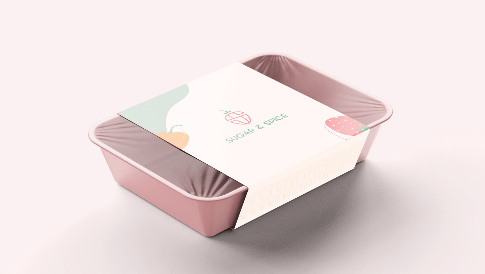
The catering industry is competitive, which is why Sugar & Spice needed a full redesign of their brand that helps them stand out and tell their story. Sabeen, who is the owner, came to us with a vision of elegance and sophistication for this venture. She wanted something that stands out from other catering businesses, but at the same time be minimal and friendly with the use of pastel colors.
Our thought process.
Brand Identity
When you think Sugar & Spice, you immediately think of an array of flavors ranging from sweet to savory. You think hot peppers to fresh fruits. You think red, green, yellow, orange, and all the different colors that make you hungry. Keeping this in mind, we started our research. We found that Green promotes healthy eating and lots of it. Orange stimulates the brain and stirs up a sensation of hunger. Red raises a person’s heart rate and causes hunger to be more prevalent. And purple, although rarely found in the world of foods, when present with all the fun, bright colors, acts as a calming agent. Combining all of these different colors and flavors, we had created a fun, friendly, yet delicate color palette that worked perfectly for the Sugar & Spice brand.
Logo Design
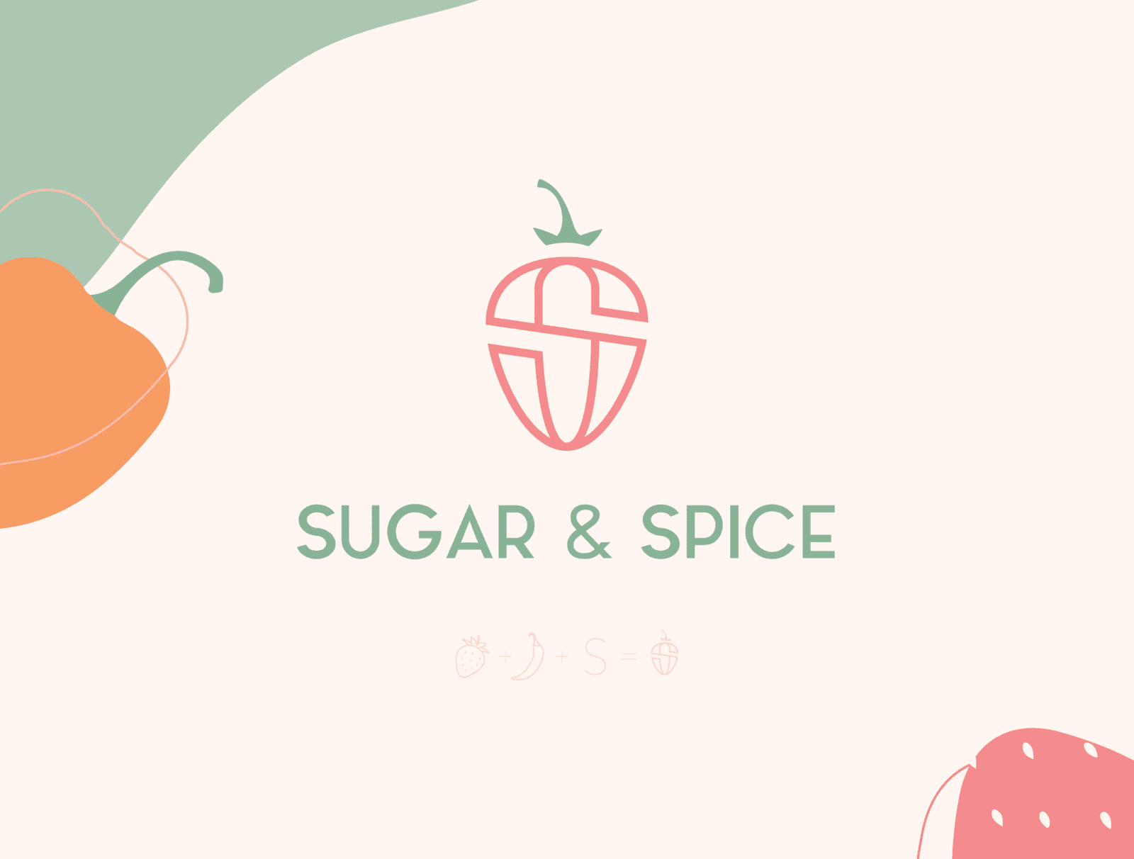
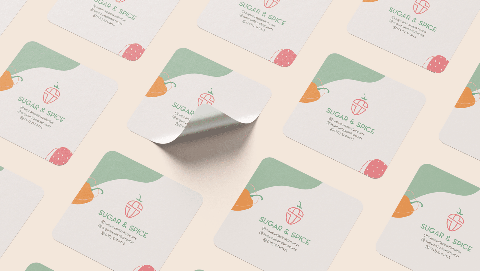
When planning the brand identity for Sugar & Spice, we knew we wanted to incorporate different peppers, fruits, and vegetables for their brand pattern. This helped create a fun, cozy identity and helped convey the different flavors catered by Sugar & Spice. For the logo, we opted to create a Pictorial mark that is easily recognizable but has a deeper meaning associated with it. We made use of the two S’s in Sugar & Spice, turned one of them into a strawberry symbolizing the “sweet” flavors and the second one into a hot pepper representing the “spice”. Merged the two together, and voila, we had a clever brand icon that is guaranteed to stand out! Can you see all the different elements?


